Welcome to the blog for my portfolio on website design.
This blog compliments my sketchbook and contains many posts covering all aspects of the design.
All the posts are indexed into sections in the "INDEX" page - located at the top of the page.
:)
Monday, 10 January 2011
Other page designs
Here I have created some mock-up designs for other pages or areas of the website, they have been analysed in my sketchbook in more detail.
Prices Page


For pages other than the homepage I may want to use different buttons to link to the help page. Therefore I have created alternative images to replace the "Question Block" design.
--------------------------------------------------------------
All of these pages and their differing links are hopefully very accessible still. By using large link buttons, visitors will be able to find them easily and make their way to the relevant pages. Also, by including links back to previous pages through the menu bar and content boxes, visitors will easily be able to get back to where they have come from - thus keeping the site highly accessible.
Prices Page

The main difference with this page is that I have changed the "Q & A" box in the sidebar to display a link to the sale page (which is the special offers page). I used red as it is a well known sale colour and it attracts the visitors attention to the reduced prices.
Sale / Special Offer Page

I have taken the bold decision to design this page totally in the website's deep red colour as it represents the sale and special offers page. As this page is so strikingly different from the others I thought it would alert the user's attention to the sale and it's offers. I have even used the red colour for the link to the "Q&A" and changed the design of this box from the Mario question block to a simple red colour so that it fits with the rest of the page.
Q & A

Although the Q & A page is not much different from the homepage design I thought it was important to include to show how I will emphasise each question and answer as well as include the phone number and link to the contact page. I also removed the Question Block link to this page and replaced it with a generic graphic I created.
Other pages
I have decided that the other three site pages will remain very similar in style to the Homepage - apart from the contact us page which will use a contact form. Examples of contact form code that I could adapt are here and here.
The About Us page will retain the same design as the homepage - but will simply contain different text in the main box.
The Recruitment page will be the same as the homepage too - but possibly with a link to something other than the Q & A so that visitors do not think that it is a Q & A for recruitment instead of a Q & A for the company in general.
Alternative sidebar buttons
For pages other than the homepage I may want to use different buttons to link to the help page. Therefore I have created alternative images to replace the "Question Block" design.
--------------------------------------------------------------
All of these pages and their differing links are hopefully very accessible still. By using large link buttons, visitors will be able to find them easily and make their way to the relevant pages. Also, by including links back to previous pages through the menu bar and content boxes, visitors will easily be able to get back to where they have come from - thus keeping the site highly accessible.
Final homepage design
Now that I have outlined and designed all aspects of my website's layout and content, I have been able to create a final design for the site.
All the previously discussed elements have come together to form a design for the homepage of my site. This design can then be used as a template and applied to other pages on the site too. Some things on the site (such as the text, google search box, and social networking buttons) are just placeholders, but they give an idea of what the site will look like when finished.
Click the image below for the full size:

There are a couple of things that will need to be incorporated still, such as the gas safety mark, but these could be added in some way to the header, as I mentioned in my post about coding.
In order to see some more detailed analysis of the homepage - see my sketchbook.
Content.
The question of content on my website is one that is very important. After analysing other plumbing websites and seeing what they included as different pages I came up with the following:

I think that these pages provide a wide variety of information about the company without overloading the user and confusing them. It is important to limit the number of pages that there are and the information that they contain so that a visitor to the site can easily find what they are looking for without any difficulty.
All of the page titles are self-explanatory and will provide relevant information within them - as well as cross-linking to other pages on the website and back to the homepage (hence the permanent link to "Home" on the menu). I also ordered the pages across the menu in an order of importance, starting with "Home" and ending with "Recruitment." I placed "Prices" and "Special Offers" next as I believed that this is the information most people wish to look at first - with information about the company after this.
I have also outlined what each page will briefly contain and I can then expand on this and work more content into it when I build the site:
Homepage
From these bullet points I will be able to include rich and varied content on either page and create links between pages in order to build up a highly accessible and easy to use website. I will mock up designs of some of these pages to show how things like the sidebar can change to incorporate different things such as alternative links and information to those on the homepage.
I think that these pages provide a wide variety of information about the company without overloading the user and confusing them. It is important to limit the number of pages that there are and the information that they contain so that a visitor to the site can easily find what they are looking for without any difficulty.
All of the page titles are self-explanatory and will provide relevant information within them - as well as cross-linking to other pages on the website and back to the homepage (hence the permanent link to "Home" on the menu). I also ordered the pages across the menu in an order of importance, starting with "Home" and ending with "Recruitment." I placed "Prices" and "Special Offers" next as I believed that this is the information most people wish to look at first - with information about the company after this.
I have also outlined what each page will briefly contain and I can then expand on this and work more content into it when I build the site:
Homepage
- Introduction to the company.
- Outline the 'company values'
- Promote the features of the company - low prices, 24 hour service etc.
- Advertise other site pages.
Prices
- List a table of average prices for different kinds of work
- (Use examples at: http://pimlicoplumbers.com/content/2/charges and http://www.homeserve.com/trades to make this realistic)
- Advertise a sale / special offers - link to the special offers page.
- Repeat company features and phone number once again.
Special Offers
- List any special offers or deals
- Link back to full price list
- Once more advertise company features and phone number
Q & A
- Provide a list of Frequently Asked Questions and their answers
- (Use examples at http://heatingcentral.com/boilers/plumbers/faq for ideas)
- Link to contact page for any more questions
- Phone number
About Us
- Provide (faked) information about the company history
- Promote the company's values
- Repeat the company features such as 24h service.
- Once more advertise the phone number
- Include testimonials? - Something that could be placed in sidebar.
Contact Us
- Include contact information
- Include a contact form.
Recruitment
- Mention company values
- Include a list of jobs.
From these bullet points I will be able to include rich and varied content on either page and create links between pages in order to build up a highly accessible and easy to use website. I will mock up designs of some of these pages to show how things like the sidebar can change to incorporate different things such as alternative links and information to those on the homepage.
HTML, CSS and other coding...
In some of my other blog posts I have just simply shown what I hope my finished website to look like but have not explained how I will make this happen. By using a mixture of HTML, CSS and JavaScript I can create different effects that will make my site look professional, modern, and do things that I want it to.
Gradient Colour in Content Box
Coding a colour gradient as the background colour of my main content box is a tricky task to do. However, I have found a CSS tutorial that makes doing this easier. By following this tutorial I should be able to include the following CSS to create this background:
Sidebar Google Gadget
Google have a custom search tool available here and it allows you to create a search tool for any website or webpage that you own.
It gives you a ready-made piece of HTML coding which you can then include in your site - it looks like this (the code was programmed for this blog's web address):
Links to Social Media
As I have chosen to use image and text links as 'buttons' to the respective social networking pages - I do not need any complicated coding, but simply just need to use the <a> HTML tag to link the images to the respective sites. The coding may look something like this:
This would then use an image - such as has been used on the mock-up home page - to link to the Twitter page for the company.
Fading Marquee in the Header
I have previously mentioned how the phone number in the header of my site could be part of a rotating marquee of text which would display different information - such as a slogan, special offer, or the gas safety images that are currently not on the homepage anywhere.
By looking through the internet I found some JavaScript code which can be used to do this:
It is important to remember though that using JavaScript like this could have a negative affect on the page's loading speed - and also on the accessibility of the site for users which are disabled for example.
Using the site logo as a link to the homepage
In a similar way to how I will link the social networking buttons to their respective websites - I can do the same with the logo / header image in order to make it clickable so that visitors can click it to return to the homepage - which is a feature used on many sites, and thus it is a good idea to include it on this site as it will make the site accessible for users.
Gradient Colour in Content Box
Coding a colour gradient as the background colour of my main content box is a tricky task to do. However, I have found a CSS tutorial that makes doing this easier. By following this tutorial I should be able to include the following CSS to create this background:
<style type="text/css">I will obviously adapt the background colour and background image (and its size) for my own design when making the site in Dreamweaver - but by using this code I should be able to use my gradient colour without too many problems.
<!--
body {
background-color: #CCCCCC;
background-image: url(images/gradient_bkg.jpg);
background-repeat: repeat-y;
}
-->
</style>
Sidebar Google Gadget
Google have a custom search tool available here and it allows you to create a search tool for any website or webpage that you own.
It gives you a ready-made piece of HTML coding which you can then include in your site - it looks like this (the code was programmed for this blog's web address):
Obviously when creating the website, a different URL will have to be used - or a mock box may have to be created - as the site may not be available on a web URL. However, even using a 'dummy' box will still show how the site could use a search tool in order to be functional - and how the site can be easily coded to include such a tool.<div id="cse" style="width: 100%;">Loading</div><script src="http://www.google.com/jsapi" type="text/javascript"></script><script type="text/javascript">google.load('search', '1', {language : 'en'});google.setOnLoadCallback(function() {var customSearchControl = new google.search.CustomSearchControl('010941611730247980388:pa0fg4vkqu4');customSearchControl.setResultSetSize(google.search.Search.FILTERED_CSE_RESULTSET);customSearchControl.draw('cse');}, true);</script><link rel="stylesheet" href="http://www.google.com/cse/style/look/default.css" type="text/css" /> <style type="text/css">.gsc-control-cse {font-family: Arial, sans-serif;border-color: #FFFFFF;background-color: #FFFFFF;}input.gsc-input {border-color: #BCCDF0;}input.gsc-search-button {border-color: #666666;background-color: #CECECE;}.gsc-tabHeader.gsc-tabhInactive {border-color: #E9E9E9;background-color: #E9E9E9;}.gsc-tabHeader.gsc-tabhActive {border-top-color: #FF9900;border-left-color: #E9E9E9;border-right-color: #E9E9E9;background-color: #FFFFFF;}.gsc-tabsArea {border-color: #E9E9E9;}.gsc-webResult.gsc-result {border-color: #FFFFFF;background-color: #FFFFFF;}.gsc-webResult.gsc-result:hover {border-color: #FFFFFF;background-color: #FFFFFF;}.gs-webResult.gs-result a.gs-title:link,.gs-webResult.gs-result a.gs-title:link b {color: #0000CC;}.gs-webResult.gs-result a.gs-title:visited,.gs-webResult.gs-result a.gs-title:visited b {color: #0000CC;}.gs-webResult.gs-result a.gs-title:hover,.gs-webResult.gs-result a.gs-title:hover b {color: #0000CC;}.gs-webResult.gs-result a.gs-title:active,.gs-webResult.gs-result a.gs-title:active b {color: #0000CC;}.gsc-cursor-page {color: #0000CC;}a.gsc-trailing-more-results:link {color: #0000CC;}.gs-webResult.gs-result .gs-snippet {color: #000000;}.gs-webResult.gs-result .gs-visibleUrl {color: #008000;}.gs-webResult.gs-result .gs-visibleUrl-short {color: #008000;}.gs-webResult.gs-result .gs-visibleUrl-short {display: none;}.gs-webResult.gs-result .gs-visibleUrl-long {display: block;}.gsc-cursor-box {border-color: #FFFFFF;}.gsc-results .gsc-cursor-page {border-color: #E9E9E9;background-color: #FFFFFF;}.gsc-results .gsc-cursor-page.gsc-cursor-current-page {border-color: #FF9900;background-color: #FFFFFF;}.gs-promotion.gs-result {border-color: #336699;background-color: #FFFFFF;}.gs-promotion.gs-result a.gs-title:link {color: #0000CC;}.gs-promotion.gs-result a.gs-title:visited {color: #0000CC;}.gs-promotion.gs-result a.gs-title:hover {color: #0000CC;}.gs-promotion.gs-result a.gs-title:active {color: #0000CC;}.gs-promotion.gs-result .gs-snippet {color: #000000;}.gs-promotion.gs-result .gs-visibleUrl,.gs-promotion.gs-result .gs-visibleUrl-short {color: #008000; }</style>
Links to Social Media
As I have chosen to use image and text links as 'buttons' to the respective social networking pages - I do not need any complicated coding, but simply just need to use the <a> HTML tag to link the images to the respective sites. The coding may look something like this:
<a href="http://www.twitter.com">
<img src="twitterimg.png" />
</a>
This would then use an image - such as has been used on the mock-up home page - to link to the Twitter page for the company.
Fading Marquee in the Header
I have previously mentioned how the phone number in the header of my site could be part of a rotating marquee of text which would display different information - such as a slogan, special offer, or the gas safety images that are currently not on the homepage anywhere.
By looking through the internet I found some JavaScript code which can be used to do this:
<!-- Paste this code into an external JavaScript file named: marquee.js -->
/* This script and many more are available free online at
The JavaScript Source :: http://javascript.internet.com
Created by: Mike Hudson :: http://www.afrozeus.com */
function setupFadeLinks() {
arrFadeLinks[0] = "http://javascriptsource.com/snippets/popup-blocker-detection.html";
arrFadeTitles[0] = "1. Popup Blocker Detection";
arrFadeLinks[1] = "http://javascriptsource.com/forms/code-box-editor.html";
arrFadeTitles[1] = "2. Code Box Editor";
arrFadeLinks[2] = "http://javascriptsource.com/miscellaneous/mailto.html";
arrFadeTitles[2] = "3. mailTo";
arrFadeLinks[3] = "http://javascriptsource.com/cookies/delicious-cookies.html";
arrFadeTitles[3] = "4. Delicious Cookies";
arrFadeLinks[4] = "http://javascriptsource.com/snippets/insertafter.html";
arrFadeTitles[4] = "5. insertAfter()";
}
// You can also play with these variables to control fade speed, fade color, and how fast the colors jump.
var m_FadeOut = 255;
var m_FadeIn=0;
var m_Fade = 0;
var m_FadeStep = 3;
var m_FadeWait = 1600;
var m_bFadeOut = true;
var m_iFadeInterval;
window.onload = Fadewl;
var arrFadeLinks;
var arrFadeTitles;
var arrFadeCursor = 0;
var arrFadeMax;
function Fadewl() {
m_iFadeInterval = setInterval(fade_ontimer, 10);
arrFadeLinks = new Array();
arrFadeTitles = new Array();
setupFadeLinks();
arrFadeMax = arrFadeLinks.length-1;
setFadeLink();
}
function setFadeLink() {
var ilink = document.getElementById("fade_link");
ilink.innerHTML = arrFadeTitles[arrFadeCursor];
ilink.href = arrFadeLinks[arrFadeCursor];
}
function fade_ontimer() {
if (m_bFadeOut) {
m_Fade+=m_FadeStep;
if (m_Fade>m_FadeOut) {
arrFadeCursor++;
if (arrFadeCursor>arrFadeMax)
arrFadeCursor=0;
setFadeLink();
m_bFadeOut = false;
}
} else {
m_Fade-=m_FadeStep;
if (m_Fade<m_FadeIn) {
clearInterval(m_iFadeInterval);
setTimeout(Faderesume, m_FadeWait);
m_bFadeOut=true;
}
}
var ilink = document.getElementById("fade_link");
if ((m_Fade<m_FadeOut)&&(m_Fade>m_FadeIn))
ilink.style.color = "#" + ToHex(m_Fade);
}
function Faderesume() {
m_iFadeInterval = setInterval(fade_ontimer, 10);
}
function ToHex(strValue) {
try {
var result= (parseInt(strValue).toString(16));
while (result.length !=2)
result= ("0" +result);
result = result + result + result;
return result.toUpperCase();
}
catch(e)
{
}
}
<!-- Paste this code into the HEAD section of your HTML document.
You may need to change the path of the file. -->
<script type="text/javascript" src="marquee.js"></script>
<!-- Paste this code into the BODY section of your HTML document -->
<div id="fade_base" style="width:250px;border:1px dotted black;padding:5px;height:60px;line-height:1.8em;">
Check out our new scripts:<br>
<strong><em><a id="fade_link"></a></em></strong>
</div>
<p><div align="center">
<font face="arial, helvetica" size"-2">Free JavaScripts provided<br>
by <a href="http://javascriptsource.com">The JavaScript Source</a></font>
</div><p>By using this code I will be able to use the phone number space in my header to contain multiple different messages - something that will be very useful on my website.
It is important to remember though that using JavaScript like this could have a negative affect on the page's loading speed - and also on the accessibility of the site for users which are disabled for example.
Using the site logo as a link to the homepage
In a similar way to how I will link the social networking buttons to their respective websites - I can do the same with the logo / header image in order to make it clickable so that visitors can click it to return to the homepage - which is a feature used on many sites, and thus it is a good idea to include it on this site as it will make the site accessible for users.
Saturday, 8 January 2011
Interaction Design.
Throughout all the designing and planning for this website, I have kept the idea of 'Interaction Design' in my mind as it is a vital element of new media design. If a website is to be successful and create a positive experience for any of its visitors then it needs to be simple, well structured and designed in such a way that allows people to interact with it fluently.
Navigation & Menu Bar.
One important element of this is navigation. Without clear and concise navigation then it is impossible for website visitors to find their way around. In order to make navigation clear, it is important to have simple menu's which do not contain too much information. I kept this in mind when designing my menu bar as it simply contains the page titles and nothing else.

Whilst this could be seen as too simplistic, I think it helps visitors to the site to find things they are looking for easily. It would also be possible to add drop-down menu's to this through HTML or JavaScript in order to add more detail to different sections of the site - if these were needed in the future for example.
The menu bar isn't the only element of site design though which is important. The main content of each page needs to be easily located and clear to the site's visitor. In allowing two thirds of the website width to be for the main content I have provided a large, clear space in which site visitors will be able to clearly read what is published.
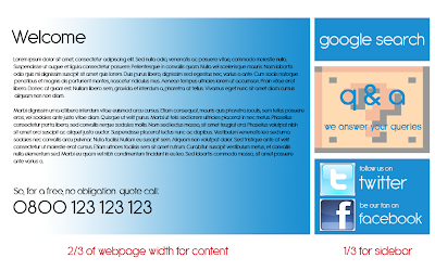
Content Box & Sidebar
To the side of the content is the spare space which can be used for other navigational elements. Whilst in my original design I allowed for simply one or two boxes, I decided that the side of the page should be home to many different 'modules' that can contain links to specific features or areas of the site.
Here are examples of how this has been used to aid navigation through the site:
Whilst this could be argued to detract from the menu bar's navigational purpose, these large blocks advertise areas of the site to the visitor and then direct them to places they may not have thought to visit before. As well as this, a Google Custom Search bar is included. Using a search bar that is provided by Google means that no difficult coding needs to be done - as it is a simple case of using the HTML that Google provide. Including a search tool on the site is invaluable as it allows visitors and potential customers of the business to find exactly what they are looking for without even having to scan through the menu's on the homepage.
Links
Every website contains endless amounts of links to other pages or to other websites and it is imperative for user interaction that these links all go to the places they are meant to. If a website contains a large amount of broken links then it's usability is crippled and people will use other websites instead.
Therefore it is crucial to make sure all links on the website's pages link back to the homepage, and provide links to all the other pages too - the reason why the Menu Bar is consistent on every page of the site. The reason why other pages need to be linked too is so that if a page links to another page, but the user does not want to view the page any more - they are then able to go back to their last visited page without using their browser's back button.
Navigation & Menu Bar.
One important element of this is navigation. Without clear and concise navigation then it is impossible for website visitors to find their way around. In order to make navigation clear, it is important to have simple menu's which do not contain too much information. I kept this in mind when designing my menu bar as it simply contains the page titles and nothing else.
Whilst this could be seen as too simplistic, I think it helps visitors to the site to find things they are looking for easily. It would also be possible to add drop-down menu's to this through HTML or JavaScript in order to add more detail to different sections of the site - if these were needed in the future for example.
The menu bar isn't the only element of site design though which is important. The main content of each page needs to be easily located and clear to the site's visitor. In allowing two thirds of the website width to be for the main content I have provided a large, clear space in which site visitors will be able to clearly read what is published.

Content Box & Sidebar
To the side of the content is the spare space which can be used for other navigational elements. Whilst in my original design I allowed for simply one or two boxes, I decided that the side of the page should be home to many different 'modules' that can contain links to specific features or areas of the site.
Here are examples of how this has been used to aid navigation through the site:
- Links to the Q&A page clearly marked
- Links to social networking media
- Links to google search
- Links to Safety accreditations like Gas Safe and CORGI.
Whilst this could be argued to detract from the menu bar's navigational purpose, these large blocks advertise areas of the site to the visitor and then direct them to places they may not have thought to visit before. As well as this, a Google Custom Search bar is included. Using a search bar that is provided by Google means that no difficult coding needs to be done - as it is a simple case of using the HTML that Google provide. Including a search tool on the site is invaluable as it allows visitors and potential customers of the business to find exactly what they are looking for without even having to scan through the menu's on the homepage.
Links
Every website contains endless amounts of links to other pages or to other websites and it is imperative for user interaction that these links all go to the places they are meant to. If a website contains a large amount of broken links then it's usability is crippled and people will use other websites instead.
Therefore it is crucial to make sure all links on the website's pages link back to the homepage, and provide links to all the other pages too - the reason why the Menu Bar is consistent on every page of the site. The reason why other pages need to be linked too is so that if a page links to another page, but the user does not want to view the page any more - they are then able to go back to their last visited page without using their browser's back button.
Header + Menu Bar = Getting there.
After creating a header image, I needed to think about the menu bar for the site. After using blue and white as the header colours, I wanted to use a colour that fitted in with Mario but contrasted the blue and white well enough to split the page clearly between content and header. I chose a deep red as this colour and think it has turned out well:
Obviously the generic page names will be updated to show different content pages once I have decided upon the site's content. There also may be more or less pages depending on how much content I feel needs to be included.
The real test after creating this Menu Bar was to put it with the header in a mock up web page. Fortunately it has turned out well and looks like this so far: (click to enlarge).
| Site menu bar |
The real test after creating this Menu Bar was to put it with the header in a mock up web page. Fortunately it has turned out well and looks like this so far: (click to enlarge).
 |
| Basic site so far. |
Subscribe to:
Comments (Atom)